Monday, December 30, 2013

Nesting Dolls

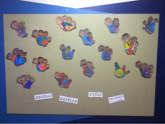
I ran across some cute pictures of nesting doll products on Pinterest, and thought it would be really cute to have the kids make some. I thought about busting out the model magic, but just couldn't find the time left before Christmas to accomplish it. So instead, I made it into a drawing project. Part of third grade curriculum is to make a family portrait of some sort, and I figured this would be a fun way to accomplish that. I found a great website that walked through the history of the nesting doll/objects, so we just scrolled through that for awhile and talked about it.

I wanted to make sure their dolls all had a good base shape to them, so I taught them how to use safety compasses first. I gave them almost 20 minutes with scrap paper to just practice making circles with the compass. You would have thought I gave them new iPads or something... It entertained them forever! 


Once they got the circles down, I gave them a large piece of gray construction paper. I showed them how to stack a smaller circle on top of a larger circle to get the basic shape of the nesting doll. These compasses had the rulers on them, so I was able to explain how to make sure the circles would be the right size they needed. Some kids had as many as seven family members, and others had three. The ones with more just did smaller dolls, but I told them they could choose how many.

They understood how to make the faces and hair for the most part, but adding the clothes was definitely challenging. I told them to start with the neckline, shoulders, and waist.


I chose to have them use color sticks to fill the dolls in. These sticks are wonderful! They are sort of combination of a colored pencil and crayon. They are relatively expensive and shatter pretty easily, so I usually just trust the older kids with them. I love how well they blend together. The color choices are limited, but we were able to pretty much make any color we needed. The colors above are skin tones and hair colors I showed them how to make. 


I emphasized outlining with darker but similar colors a lot. For example, below I outlined the orange shirt with red so that the sleeves were differentiated from the shirt. 


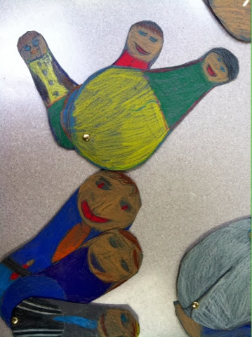
While the kids were still drawing them, I had taken mine to an elementary art meeting in the district. God bless these sweet ladies, they are sooo incredibly helpful to me! One of them suggested fastening them together with a brad so the kids could actually "nest" them. 

And it worked wonderfully!!!!! 


As you can see, the kids all had their own "unique" shape going on with their dolls, but they all looked cute nonetheless! 


A few days too late, I ran across this book on the shelf in our library. It is a Russian folktale centered around Christmas. 


I flipped through the pages and ran across the Baboushka polishing these nesting dolls and thought this would be perfect to read to the kids! However, we just ran out of time... Next year! 

Stamp Designs

While rummaging through the drawers and cabinets of my new classroom back in August, I ran across several packages of these stamp-cut papers. I talked with the fifth grade teachers about something they were studying, so i could have their stamps relate. In science, they were studying animals- so it really doesn't get much easier than that! I had them all write down the animal of their choice, and my helpers and I went through all my how-to drawing books for each animal and made some photocopies for them to reference. 


I had them practice their animal several times in their artist's notebook so they could carefully plan out their design without wasting all the stamp paper. I encouraged them to add words with stencils and a cent value. They all wanted to color them, but I feared they would rush through it and take away from the fact that they produced some high-quality fifth grade drawings. 


We discussed value in a few previous projects, so I showed them how they could incorporate some value with ink. After pencil, they outlined everything in sharpies of various sizes. The shark below was a good example of value. I showed her how to gradually space out her pen strokes as she moved down the shark to transition from black to white. 


This turtle below, was my absolute favorite (if I'm allowed to have favorites). I wish he would have explored some texture or value more, but his contour drawing was so cute! Other turtles had generic grid-patterned shells, whereas he took the time give each piece of the shell attention. 


It's so hard not having the space or time to hang every single piece! They were all so cute, and they all worked so hard on them! It's amazing how much interest rises when they get to make a choice about what they draw. 

Saturday, December 21, 2013

Panda Bears


Animals are always a safe bet for kids. They seem to love all animals are fascinated by them. I figure this is an easy way to incorporate science and non-fiction books. After reading this book five times, I knew so much about pandas- you would think I had an obsession! The kids retain this stuff at crazy rates, as well. 


I started the first few days with a step-by-step panda I found online. The kids were struggling, but got it with a lot of guidance. It just felt like it was out of their "zone," though, so I found an easier one. You would be amazed at how well some books break down animals. The book I finally settled on made it very simple and doable for them. 

Once they got the panda drawn, which took about 15 minutes, they cut him out. They are still perfecting their cutting skills in first grade, Going in between toes and such is still pretty hard for them. They glued him to a piece of construction paper. I kept this one pretty small. The green paper is only 9x12. It's hard enough to get them to draw things big enough to fill that, let alone a full piece of construction paper. 

I they had time, they added the bamboo in the background. I showed them some pictures of bamboo and pointed out the lines in between each section of the stalks. So, they just glued rectangles on top of each other with a sliver of space in between. 

I really love doing how-to drawings with them, because it gives them so much confidence for drawing in the future. Obviously observation drawing is more "Accurate," but you have to start somewhere! And they wont know where to start if they can't located simple shapes inside a complex object/animal. 

Frank Stella Collage

This was a pretty simple simple lesson, but cool nonetheless! I showed the first graders a bunch of Frank Stella's work and just asked them to tell me what they saw. They commented on his lines and colors and "puzzle-feel." So that's what we did! We made puzzles. 


I gave them just a white piece of paper and showed them how to make these concentric circles and shapes that overlapped. They thought it looked soooo cool! A lot of creative twists were taken, and I really didn't see any that didn't look great. 


After they finished those with marker, I told them to cut it into between eight and ten pieces. Part of the fun was putting these pieces back together on a piece of construction paper. I kept reminding them not to start gluing the puzzle back together until they were absolutely sure it was correct. Obviously some were unable to get it perfect, but the results didn't really take away from the project all that much. 

Picasso Self Portraits


I am finding literacy to be one of my favorite parts of my job! I just love reading to the kids and am amazed by all the clever books I keep finding! This story was incredibly clever and really did an awesome job comparing and contrasting Picasso and Matisse. The illustrations for each character were very characteristic of the actual artist. And they were fun! The kids were highly engaged in the story and laughing out loud. My favorite line to read was "Your work looks like paint-by-number!" I wanted to say "A-burn!" like on HIMYM. 


This was another quick, one day lesson. The younger kids seem to do better with these types of lessons. I forces them to work work hard and stay engaged for the time they have. Most of them hate the thought of not finishing, so they stay pretty on top of things.

We started by drawing the basic shape of the face, and I showed them how to do a few different hairstyles they could do for boys and girls. Then, I let them pick out four little pieces of construction paper in whatever colors they wanted. I gave them some ideas about different facial features, but reminded them that Picasso's features were not realistic or proportional. They used pastels for these. I think adding the white pastel to the eyes made a world of difference. 


To finish it off, I had them made blocks of color on the rest of the face. With this particular class, they picked the skin tone they wanted for their background construction paper. Other classes, though, just picked and  random color. I think I preferred the multicolored ones. The peaches and browns just looked a little dull for Picasso. 


O course most of them could not resist a mustache or some sort of reference to "Minecraft." I'm okay with that, though. Someday they will look back and say, "Remember that year that everyone loved mustache symbols?" 

Tuesday, December 10, 2013

Value studies


I promise fourth grade is not being neglected- they are just one of the few grades that actually had a unit of study going on for more than two or three weeks. I introduced them to the element of value over a month ago and drilled the concepts of tints and shades into their smart little brains over and over. I love doing these value scales below. I gave them some creative options, rather than just filling in the boxes. Instead, they used patterns such as bubbles that got smaller and smaller or diagonal lines that got closer closer and closer together. Colored pencils worked well for this because you can get them really sharp for intricate details. Lastly, they filled in the letters of "VALUE" with actual shading. 


The next class period, I went over how to draw three of the most basic forms in drawing- the cube/rectangular prism, the cone, and the sphere. (I'll be adding cylinders next year!!) They were required to draw four sets of these three forms, adding values/shading to each with a different kind of shading. If I remember correctly, we did hatching, cross-hatching, stippling, and blending. They did all of this with construction paper crayons on a neutral construction paper I did it again myself on a darker paper, and liked the results a lot more. The darker paper helps the crayons pop more. 


To wrap up or unit on value, they did a final piece that gave them practice with practical use of tints and shades. I talked them about how when you look at a landscape such as mountains, the colors get hazier the further away from you they are. So, we drew a few sets of mountains doing just that. We began with purple acrylic for the foreground. Next, we made our first tint by adding a little bit of white. Last, we used mostly white with a touch of purple for the background mountains.  


We let those dry overnight before going back over them with oil pastels. They blended oranges and yellows to create a beautiful sunset sky above the mountain ranges. 


To further emphasize the concept of foreground, we used black oil pastels to draw the silhouettes of different plant life. I emphasized filling them in dark and using different sizes to show their spatial relationships.  


I like the cacti because they were pretty easy for them to draw and stayed recognizable. For the trees, I reviewed "V" trees, but I almost think this one turned out too Halloweeny. Maybe its the bat flying around in the sky???


I loved how simple these were, yet they were packed full of teachable moments!


Lichtenstein Fruit Bowls

By the end of this 3rd grade project, there were about three or four different versions floating around. Considering I have five sections of 3rd grade, I just couldn't seem to get it right. However, I was very happy with one result in particular, so I would call it a success. That's what your first year is for anyway, right? 

I began this lesson by showing the kids some pictures of traditional still life paintings. Their definition of still life usually involved a person sitting still, so we had to revise that a little. Then, I showed them some famous Pop art from Andy Warhol and Roy Lichtenstein and had them describe it to me. I just love using questioning with them. 3rd grade especially loves to hear themselves talk, and they are old enough to really dig into higher order questions. Lastly, we looked at Lichtenstein's "Still Life with Crystal Bowl." I had them tell me how this one was different from the traditional still life paintings we saw before. They agreed that his was less realistic and heavily outlined. 


All five classes began by drawing fruit onto some heavy card stock. it took us a very long time to get all of these done as they needed a lot of help. I did my best to break down each fruit into shapes/lines they could handle. We filled them up with patterns similar to the comic-like art of Lichtenstein. 


After they cut out their fruit, a few different backgrounds came into play for a few different classes. I attempted to incorporate a cornucopia for Thanksgiving. As you can see from below, though, it turned out a little abstract for my liking. 


The next day, we went ahead and drew the crystal bowls like Lichtenstein's. They looked much better, and were a lot more relevant to the kids. It also gave them practice drawing ellipses, spheres, and cylinders. 


They outlined the bowls in black marker then began to arrange their fruit into the bowl. Rather than gluing the fruit down, I had them use the 3D foam stickers. They are meant to raise pieces in a collage to allow for overlapping. 


I really like how they turned out, because it gave the kids a chance to arrange their still life themselves and gave the picture authentic shadows from the overlapping. 


Once they got their fruit arranged into the bowl, I let them add black and white stripes to the background (these were done using the thickness of a ruler). The piece below was done with a class that only had one day to work, so they had to draw their fruit right into the bowl. I loved that it only took one day, but wish it could have had just a tiny 3D element. 


I went ahead and displayed a few different versions of the project on our bulletin board. It's kind of fun when each class does something a little different. I definitely helps me solidify which ones are worth repeating the next year, and it gives kids (and adults) a chance to compare and contrast every time they walk by on their way to the drinking fountain or back to class.  

Sunday, December 8, 2013

Van Gogh Sunflowers

Vincent Van Gogh's "Sunflowers" are part of Kindergarten print curriculum, so we started out by reading the book "Camille and the Sunflowers" by Laurence Anholt. I am so impressed with this author. He paints such a creative picture of artists with clever stories based on their lives. In this story, Camille was the son of the postman Van Gogh used as the subject of one of his paintings. It even had a page where Van Gogh had an easel gazing at the cypress tree under the swirling stars of "Starry Night." I don't think Kindergarteners delighted in all these details nearly as much as an art nerd like myself, but it was still a cute story for them to introduce the project. 

 I'm still struggling with my thoughts about letting Kindergarten trace anything. I'm trying to only let them trace circles because my older kids use compasses to get perfect circles. Tools can be a good thing, but I really want them to just learn to draw by making mistakes. I went ahead and had them trace a paint dish to get the basic shape/size of the flower vase. 


I told them to put little stars above the vase in five different places. It cracked me up walking around to see them draw five stars in a straight line. It looked a little goofy, but they did follow my directions so I couldn't complain. 


The goal was to create a wax resist, so they used crayons on their paper. I showed them how to start in the middle of the flower with brown and move outward with yellow and orange. They all did a very nice job just using crayon, but I don't want them to think that art is just coloring time, so i added another step. 
                             

They absolutely loved crumpling up their paper- it was just too funny! 


They flattened it out and made it semi-smooth again but with cracks in the wax. 
                             

They needed a lot of supervision/help with the last step, so I called them up a few at a time to do this with me. I watered down some regular blue tempera and they wiped it across the paper, letting the wax show through. 


Below was my vision for the project. A lot of them turned out to be a mess, but one little girl used pink crayon for the background, and it turned out a lot cooler. In the following classes, I encouraged them to not use blue. One class has significantly less control of their motor skills, so we skipped the painting altogether. 


Maybe I could do a collage and just do the crinkle effect as the background next time. I see a lot of different ideas for these popular paintings, but there really weren't a lot of options for this one that didn't involve tracing the flowers. If I can convince myself that tracing still allows for creativity and strengthens their drawing, I might start using those tools more often. It's a difficult balance between making their piece look "better" (aka cleaner) and making it more authentic.